Field
Type |
Description |

|
A rectangular box indicates a field in
which you can enter text and/or numeric values. The size of the
box varies according to the type of information requested. If
the data entered in one of these boxes must be in a particular
format, ezLaborManager
checks the format of your entry when you move your cursor out
of the box and displays an error message if there are any problems
with your entry. This type of box is used frequently for entering
times,
numbers,
and free-form text notes, such as explanations and descriptions. |

|
If a  appears to the right of a boxed field,
any data entered in the field must represent a date. You can enter
the date manually, or you can click the calendar icon to select
the date from a calendar. For more information about the accepted
formats for dates and for instructions on how to use the calendar
lookup, see Specifying
Dates. appears to the right of a boxed field,
any data entered in the field must represent a date. You can enter
the date manually, or you can click the calendar icon to select
the date from a calendar. For more information about the accepted
formats for dates and for instructions on how to use the calendar
lookup, see Specifying
Dates. |

|
If a  appears to the right of a
boxed field, your entry must be drawn from a specific list of
values that are already stored in the database. If you know an
appropriate value, you can enter it manually. You can also start
typing the word and auto-suggest will display values based on
what you are typing. If you do not know what the available choices
are, you can either use auto-suggest to get a list of possible
choices or you can click the appears to the right of a
boxed field, your entry must be drawn from a specific list of
values that are already stored in the database. If you know an
appropriate value, you can enter it manually. You can also start
typing the word and auto-suggest will display values based on
what you are typing. If you do not know what the available choices
are, you can either use auto-suggest to get a list of possible
choices or you can click the  to view a lookup window that contains a complete list of appropriate
values. Whatever way you use to enter data into the field, once
you click an item, the selected value is entered into the field.
For more information, see Using
Lookup Windows.
 |

|
If the
 and and  buttons
appear to the right of a boxed field, the field can accept multiple
values, but each value must correspond exactly with an item on
an associated lookup window, which can be opened by clicking the buttons
appear to the right of a boxed field, the field can accept multiple
values, but each value must correspond exactly with an item on
an associated lookup window, which can be opened by clicking the
 button. You cannot add items to this type
of field manually. You must use the lookup window. See Using Multiple-Selection
Lookup Windows for instruction on how to enter and edit information
in these fields. button. You cannot add items to this type
of field manually. You must use the lookup window. See Using Multiple-Selection
Lookup Windows for instruction on how to enter and edit information
in these fields. |

|
A series
of options with round buttons (radio buttons) next to them indicates
a mutually exclusive or "either-or" option. You can
select only one of the options in a group. When you change from
one option to another, by clicking in a blank circle, the circle
for the previous selection will be cleared, since only one option
can be active at a time. |

|
A box
with a  indicates that
the field requires one of a limited number of options, which can
be viewed by clicking the indicates that
the field requires one of a limited number of options, which can
be viewed by clicking the  . To
make a selection from the list that appears, simply highlight
and click your desired choice. The menu will close and the field
will be populated with your selected value. In most cases, the
selection will be immediately applied. For instance, if the value
in the example shown here were changed to Tomorrow, the data being
displayed on the page would immediately be refreshed to show information
about tomorrow. . To
make a selection from the list that appears, simply highlight
and click your desired choice. The menu will close and the field
will be populated with your selected value. In most cases, the
selection will be immediately applied. For instance, if the value
in the example shown here were changed to Tomorrow, the data being
displayed on the page would immediately be refreshed to show information
about tomorrow. |

|
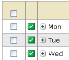
Check
boxes like those shown here allow you to select multiple items
and then perform a function using all of the selected items. To
select each item you want to include, simply click the corresponding
check box. If a check box appears in the header row, you can click
it to select all of the items in the table. In this example, clicking
the check box in the header row causes the check boxes for Mon,
Tue, and Wed to be checked. To de-select
an item, simply click its check box again. After you have selected
your items, you generally click a button to perform a procedure
on or with the selected items. For another example of check boxes,
see Using
Multiple-Selection Lookup Windows. |


